
Decide when and where each text layer belongs before styling a mobile ad. Spoken captions carry the words being said, identity text explains what the viewer is looking at, and action text gives the next step. If all of them compete to be the headline, the frame gets crowded.
Use a mobile frame text-role audit to decide which information deserves attention in each beat, then check whether other text gets in its way.
The layouts below are illustrative; they haven't been returned as Fablo frames. They help assess readability and communication quality. A cleaner layout alone doesn't establish stronger campaign performance.
Start with the scene's communication job
Ask what the current beat needs to explain: what is this, how does it work, or what happens next? Use the answer to set the hierarchy.
A demonstration may need the product action to lead, with captions supporting it. A category reveal may benefit from a short identity label. At the ending, give the invitation room to lead. Some frames won't need every text role.
Only combine a large benefit headline, full spoken caption, repeated product name, and action button if each adds necessary information. Try removing repetition before shrinking the type.
Keep important qualifications with the claim they limit. If a condition changes the meaning of a promise, hiding it in tiny text changes the message too. Address the wording and its visibility together.
Separate the three roles
Spoken captions: preserve the actual meaning
Build captions from the final audio and check names, negations, quantities, and limitations against the spoken words. An earlier script may no longer match. A missing "not" can reverse the claim, however good the typography looks.
Break captions into readable phrases, then check their timing at normal playback speed. If the scene needs less speech, shorten the approved line and update the audio. Deleting meaningful caption words to fit a marketing overlay would leave the two out of step.
Check whether the destination will show native captions alongside burned-in captions. Preview that configuration to see whether the layers cover the demonstration. You'll need to inspect the platform-rendered version even if the source export looks clean.
Product identity: resolve a real uncertainty
Use an identity label where it helps someone recognize the category, brand, or exact product. It can do that without repeating every spoken word.
In the fictional lamp teaching example, "Adjustable desk lamp" names the object without adding a brightness or health claim. You may not need that illustrative label if the product is already unmistakable and the narration names it.
For an existing product, use the approved name and packaging references. Inspect the physical package text separately from editorial overlays, and record mismatches in the product-fidelity ledger. You'll need to correct an inaccurate label on the depicted object even if the overlay is right.
Action text: make the next step coherent
Use the approved invitation consistently across the overlay, spoken ending, platform call to action, and destination. Their next steps need to agree. A viewer following "View the collection" shouldn't arrive at an unrelated signup form.
At the ending, reduce other overlays if needed while keeping captions for any remaining speech. Keep the offer and its conditions with the invitation, including when you crop the frame.
Check the placement, not a universal margin
Each platform interface takes up space differently. TikTok's official Auction In-Feed Ads guidance, checked October 7, 2026, says safe-zone size depends on video dimensions, ad-caption length, and additional formats. It provides different templates, including versions for ads with anchors, and notes that previews can differ slightly from live display.
Choose the current template for your actual format, region, and interface features. TikTok uses "ad caption" here to mean platform-displayed ad copy. It's separate from your spoken subtitles, but its length can still change the space available to the creative.
Preview the actual crop and interface wherever you plan to run the ad. A template for one placement won't give you a universal rule for another platform. Keep important product details clear of likely obstructions too: readable captions can't explain a mechanism the interface hides.
Copy the mobile frame text-role audit
Audit the moments when text changes, the background moves, the product is demonstrated, or the action appears. Record where each occurs in the exported file.
Export/version: [exact candidate]
Placement and crop: [intended platform/format]
Preview conditions: [device, interface, safe-zone template version]
Frame/interval: [actual location; attached image if useful]
Communication job: [identify / demonstrate / explain / invite]
First attention should go to: [product action or named text role]

Spoken captions: [actual words, timing, line breaks, completeness]
Identity text: [wording; why it is needed at this moment]
Action/offer text: [wording; destination and relevant conditions]
Package text: [visible approved wording; fidelity concerns]
Conflicts: [duplicate meaning, overlap, poor contrast, blocked detail]
Change: [remove repetition / retime / reframe / revise approved copy]
Recheck: [full-speed phone playback, sound on/off, platform preview]
Decision: [accept / revise / cannot assess; reviewer and version]
Watch contrast through the whole interval. A caption that reads against a dark desk can disappear as the shot passes a bright lamp shade. Recheck the delivered export after compression.
Illustrative diagnosis: three layers saying one thing
Suppose a proposed lamp frame combines a large "Light your next task" headline, a full category sentence as subtitles, and an "Adjustable desk lamp" label across the hinge. The text repeats the identification while covering the feature the shot needs to explain.
For an illustrative revision, clear the hinge area for the demonstration and put speech captions where they're readable. Omit the extra category label if the scene already identifies the object. Move the invitation to its intended ending beat so it doesn't repeat over the mechanism. Request that layout change without reopening the whole concept.
These choices still need to be tried in an actual export; they don't describe a correction made to C1 or C2. The scene-revision planning guide shows how to keep a fictional lamp-reveal request focused and plan the resulting text checks. To report an observed frame diagnosis, you'd need actual footage and a recorded inspection.
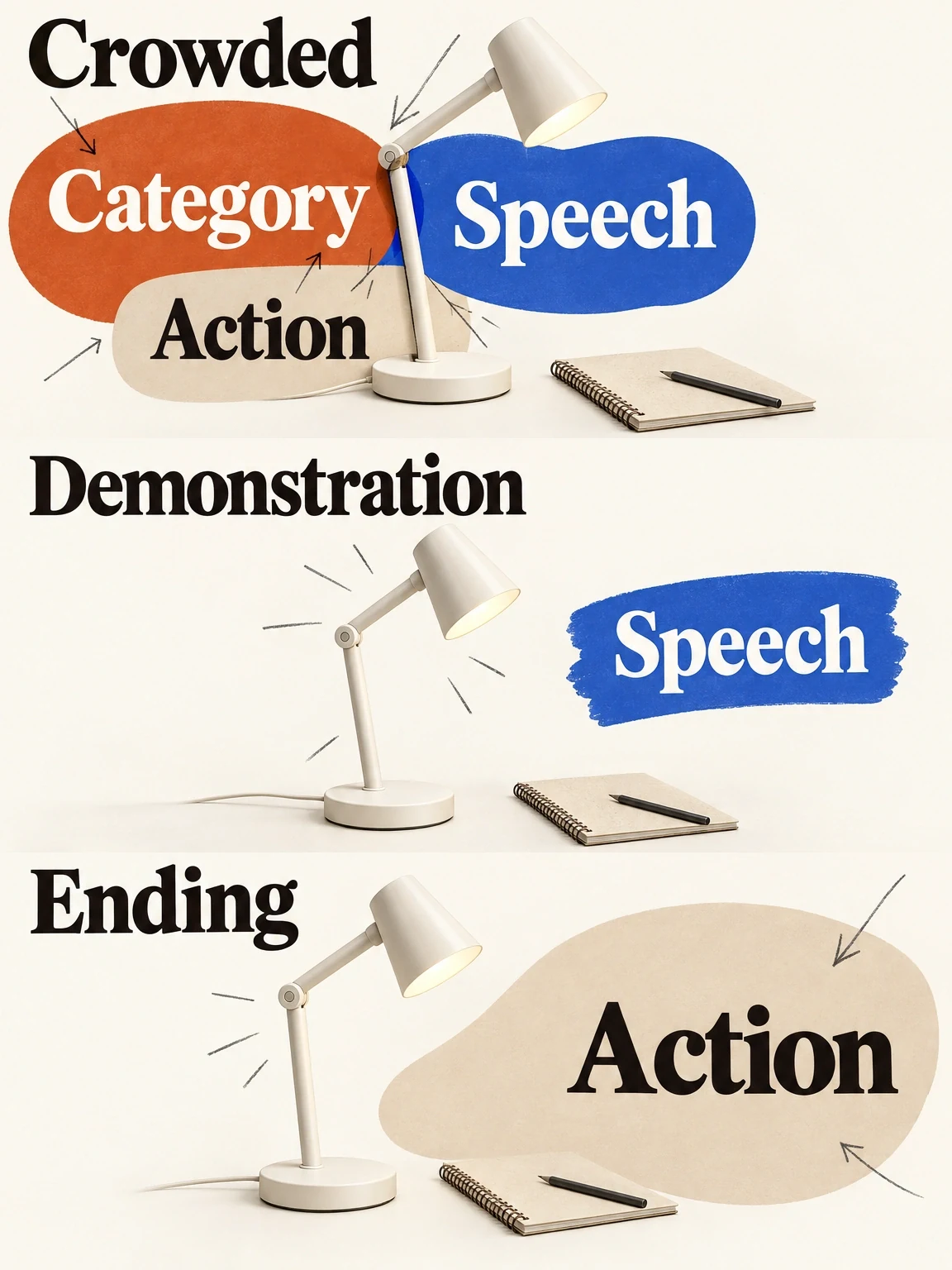
Let each text layer take its turn
In these fictional lamp layouts, text takes turns so the hinge demonstration stays visible and the invitation has room at the end.
View full-size (opens in a new tab)Image explanation
- The crowded layout puts identification, speech and action text over the hinge, hiding the demonstration.
- Give the text layers separate times and spaces. Necessary captions support the clear product action; the invitation takes priority at the ending.
Review the whole sequence on a phone
Watch at normal speed with sound, then use the sound-off storytelling inspection. Check meaning, reading time, text transitions, product visibility, and the ending. A paused screenshot can reveal overlap, but you'll need playback to judge whether a caption stays long enough to read.
Use the creative-revision workflow to plan the work identified by the audit. Bring the completed audit and approved wording, then open Fablo to produce a readable mobile-ad revision. Fablo's monthly plans provide recurring credits. Text changes requiring new speech or footage can use more of that balance than a layout edit alone, so review the scope and estimate before approving the revision.
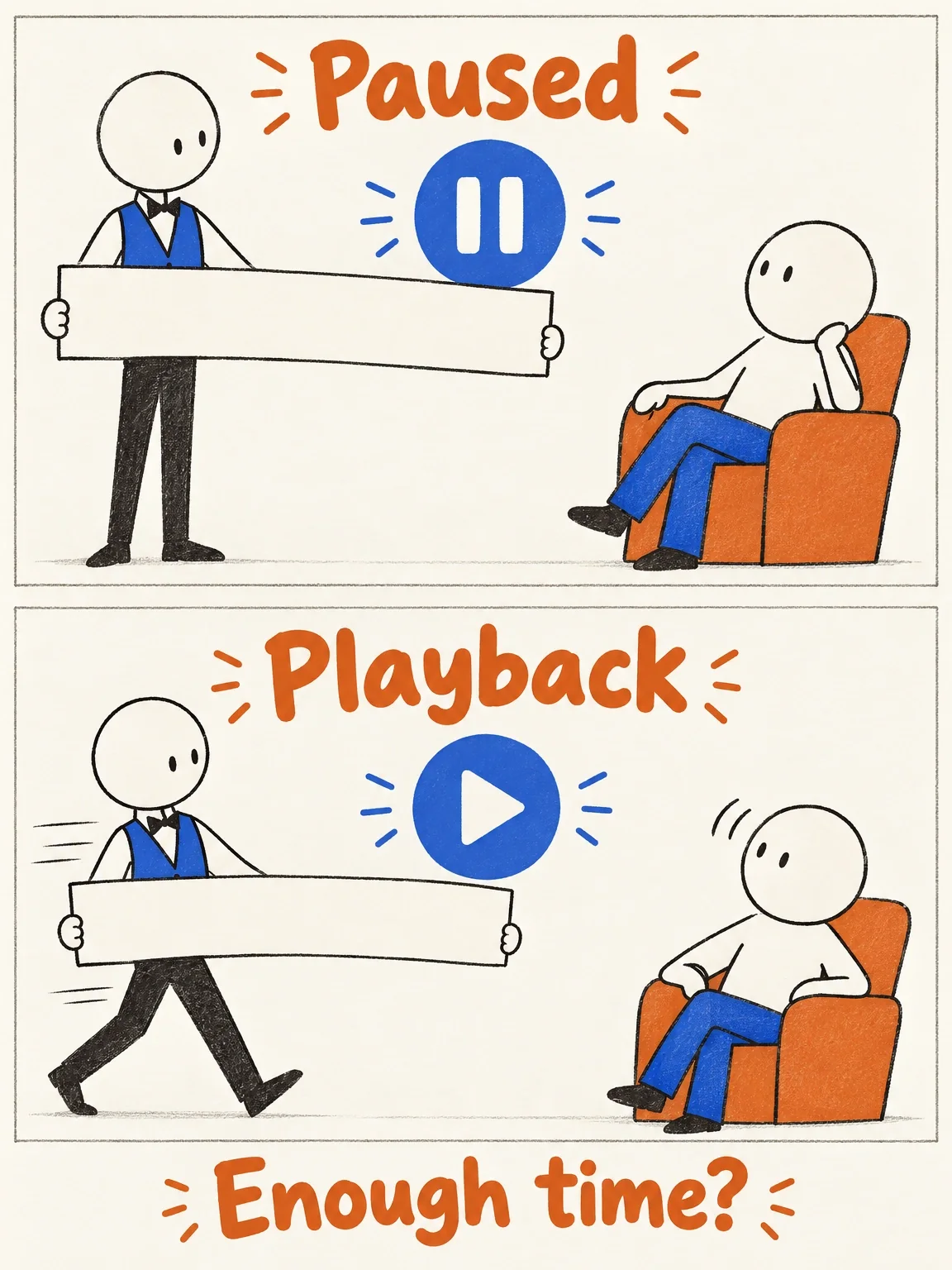
The pause button is a generous host
Pause gives the reviewer all the time they need. Playback adds the question the still cannot answer: was there time to read?
View full-size (opens in a new tab)Image explanation
- A paused screenshot can reveal overlap. It leaves the time available for reading during playback unchecked.
- Review the actual sequence at normal speed on a phone, with sound and without it. Check meaning, readable exposure, transitions, product visibility and the ending; compare captions with final speech and inspect the intended placement's crop and interface.
- The blank bands are timing props, with no actual caption wording or pass or failure recorded. The drawing sets no universal duration or safe margin.