No typeface wins on conversion in every ad. Choose one that fits the brand, renders the required characters correctly, and stays readable with your actual wording, background, timing, and display size. Check the exported video on a phone; a large design-board preview won't tell you enough.
Keep a type specimen and font-selection record with the exact family, file, weight, words, fallback, and review conditions. That gives the next producer enough information to reproduce the choice.
Choose for the letters you actually need
Try the brand's approved type with your exact copy. A face that looks good in a short logo may struggle with a longer sentence, dense numerals, or accented words.
Inspect the features that affect this particular message:
- Can you distinguish capital I, lowercase l, and numeral 1 where they occur?
- Are open letter shapes still distinguishable at the intended display size?
- Does the chosen weight survive the moving background without filling small spaces inside letters?
- Are accents, punctuation, currency symbols, and required language characters present and correctly placed?
- Can the line fit naturally without extreme squeezing or tiny type?
Use these questions to inspect the actual face and text. They don't rule out every serif, condensed, or display face. The caption-hierarchy guide helps you decide what the text needs to do; choose typography that suits that role.
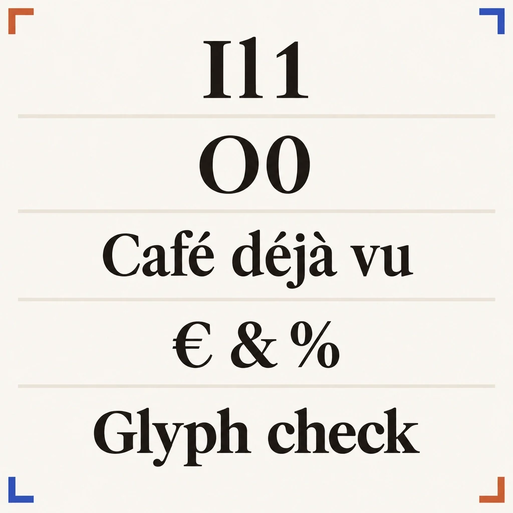
The exact characters are part of the specimen
The article's inspection strings show which characters to probe. A font decision needs the actual font file and campaign text.
View full-size (opens in a new tab)Image explanation
- Use the actual approved text to check letter and numeral distinctions, accents, punctuation and required symbols.
- This conceptual drawing demonstrates no real font file. Check candidate rendering in production at the intended size and timing.
Compare candidates with identical wording and layout
Keep the message, line breaks, exposure time, and background the same while comparing typefaces. Otherwise, you might prefer shorter copy or a quieter image and credit the font for the difference.
Start with the approved brand face. If it doesn't work for small mobile text, test a brand-approved companion. You can use different typography for the headline and speech captions while keeping one visual system, without replacing the brand identity everywhere.
Check weights during normal-speed playback. A heavier face may stand out against one background but crowd a narrow line. A light face may look elegant when paused, then disappear over a moving highlight.
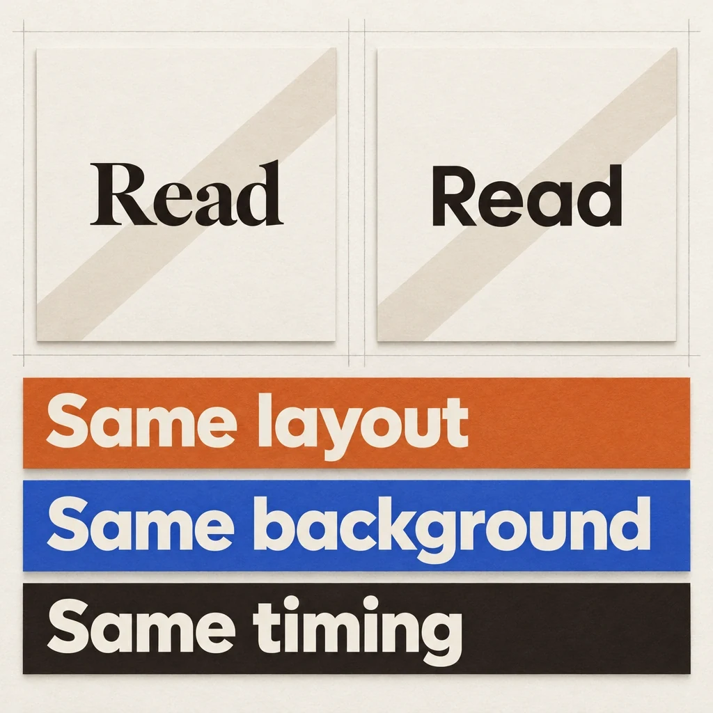
Give the typefaces the same assignment
Give the typefaces the same words, layout, background and time on screen. These drawn plates illustrate the comparison setup.
View full-size (opens in a new tab)Image explanation
- Compare the approved brand face and any approved companion with wording, line breaks, background and exposure time held constant. Otherwise a copy or layout change can drive the preference.
- If a candidate needs another line break, record the layout change and compare again. Final selection needs actual font files and normal-speed exported, compressed and placement previews.
- The conceptual plates supply no real rendering test, licence, glyph-support or campaign evidence.
Worked specimen: a fictional pen launch
Suppose a fictional refillable-pen brief uses the name “PÉPIN” and the line “A place for your next note.” The brand supplies a display face but hasn't decided whether it suits supporting text. For this exercise, compare it with Source Sans 3 as a possible companion, subject to brand approval and production availability.
Use this exact specimen in each candidate:
Brand: PÉPIN
Category: Refillable pen
Main line: A place for your next note.
Action: See the pen
Inspection-only strings: Il1 O0 | Café déjà vu | € & %
Keep the final line in the specimen only; it's a character probe. Add the campaign's actual languages and symbols, since this short string can't test every glyph or establish translation quality.
Test the headline over a still product composition, then the supporting line over the planned hand-and-notebook movement. If a candidate needs a different line break, record the layout adjustment and compare again. Wait for actual candidate exports before naming a winning font. This exercise describes how to choose one; it doesn't report a measured result.
Record the font source and an approved fallback
Adobe's official project identifies Source Sans 3, and its published licence is the SIL Open Font License 1.1. Both were read on October 8, 2026. These sources identify this candidate and its licence. A different brand font needs its own licence check, and rendering support still needs confirmation.
Keep the actual font file's licence with the production inputs. For a commercial brand face, check the applicable use permissions with its official licensor. You'll need more than a family name copied from a website to specify the font fully.
Specify the file, weight, and approved fallback, and ask production to flag any missing face or glyph before substituting it. Fablo makes finished creative through chat. Check support for your requested font file, writing system, and shaping features instead of assuming that naming them guarantees support.
The proposed brand-starter-sheet brief helps organize these decisions with the other identity inputs. Its external references can guide planning, but they don't document completed Fablo typography tests.
Inspect the compressed video at its viewing size
Check type again when reframing. Use the placement-version decision sheet to decide whether to crop, reposition, or request a new composition. Squeezing the same text into every frame may not work.
Watch the actual export on a phone without enlarging the text. Read it once at normal speed, then inspect any suspect frames for accents, line breaks, clipped letters, and unintended fallback glyphs. Check whether you can still read it as the background changes.
Review a compressed preview as well as the source export, and record the preview conditions for the reviewer. A readable paused high-resolution frame can't establish readability at full speed.
Consult the current Meta Ads Guide for the intended format and placement, then inspect that placement's preview. Base your margins on the actual composition and interface instead of borrowing an arbitrary pixel margin or universal “safe area.”
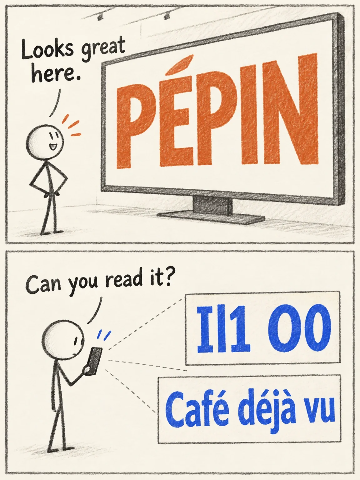
The giant-preview trap
The fictional pen's lettering looks generous on a design board. Font selection still needs the exact file, required characters and compressed phone playback.
View full-size (opens in a new tab)Image explanation
- A giant preview cannot tell you whether the glyphs, contrast and text will work during normal-speed phone playback.
- Compare actual approved font files under identical conditions. Inspect final and compressed exports with all the necessary characters.
Copy the font-selection handoff
Store the accepted specification with the brand input packet so later production can use the same choice.
Text role: [headline / supporting line / speech captions / action]
Exact wording and approved language: [copy, including punctuation]
Primary font: [family, official source, actual file, version]
Weight/style: [specific supplied weight; no silent substitution]
Licence record: [official terms checked for this file and use]
Required glyphs: [characters from the actual approved text]
Fallback: [approved alternative; flag before using]
Specimen conditions: [same wording, layout, background, timing]
Final review: [phone playback, compressed preview, placement]
Observed issue and decision: [complete after inspecting the export]
For a new video, bring the record into the product-ad workflow and open Fablo with your branded production brief. If a candidate already has a typography problem, use the creative-revision workflow to define the correction, then review the plan and estimate for that work. For ongoing branded production, compare the plan options with the work you expect to need; don't assume a fixed number of finished videos.